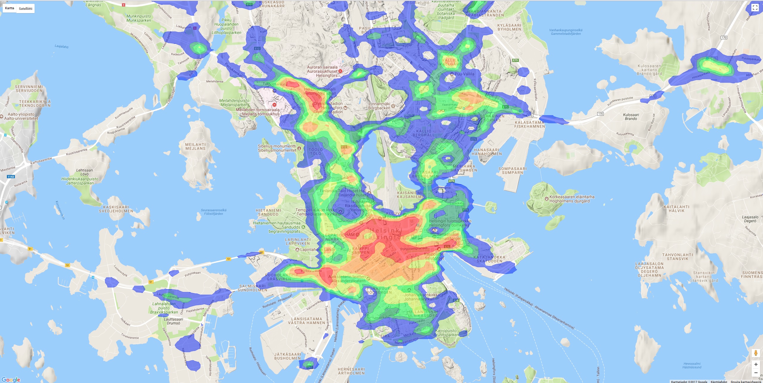
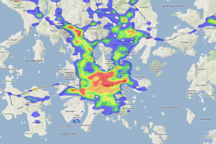
Liikenneonnettomuuksien tiheys lämpökarttana

Cloud'N'Sci Oy - Published 29.11.2017 - Updated 11.12.2017
  1. 2017-11-29-120303.656750heatmap.jpg

Yearly, there are so many traffic accidents in Helsinki that a map-based visualization of the scenes of accidents is not sufficient enough to see the bigger picture. There's been at least one accident in almost every crossing or intersection, so the map fills up with points on top of each other rather quickly. Comparing different areas is very cumbersome.

With the help of heatmaps, it is possible to summarize the same information into colourful pictures. They make it easier to understand the information at first glance. In this visualization, the colours on the heatmap represent the density of accidents in relation to the surface area. In other words, if you want to avoid traffic accidents, stay away from the red areas!

Used datasets

comments powered by Disqus