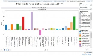
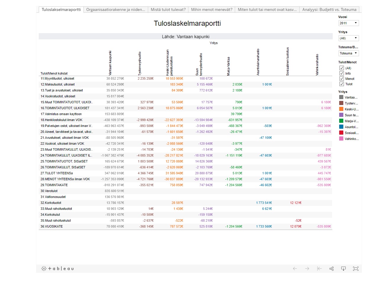
The visualization shows data related to City of Vantaa earnings and expenditures during year 2010 to 2011. It presents analytic view of data that was originally presented in excel rows and columns. The visualization consists of 6 different types of dashboard reports each answering interesting questions like how much was for example gross profit for city of Vantaa, where the earnings come from and where expenditures go etc.
Earlier visualization that had analytic perspectives demanded that reader should understand the basics of accounts. This visualization has made sure that readers should not need to know how profit and loss account is made, how percentage is calculated etc. This visualization answers every question that comes to mind on the first glance when one sees huge excel data.
The original data was huge and very complex to understand. There were many account heads for example VOK that were in excel sheet for information purpose. I deducted VOK from each expenditure heads and made a new data where I classified data in more understandable structure.
The improved data is then feed into Tableau public software and 6 different dashboard reports are made.