Date
Categories
Author
-
Petja Partanen
Map art of numeric data with QGIS

Topi Tjukanov’s innovative visualisations are spreading around the world through Twitter. “There is a lot of data just lying around, which can be made really useful with a few small things.”
Ministry official during office hours, map artist in leisure time. The results of Topi Tjukanov’s spare time hobby are shared actively on Twitter ahkerasti. The visualisations of the US road network have ended up, for example, in Daily Mail and the front page of Reddit. For YLE’s (Yleisradio, Finnish Broadcasting Company) news page, Tjukanov has visualised the annual size of the arctic ice cover. “I like popularising data”, says Tjukanov of his hobby.
Tjukanov describes his visualisations of open data reserves as drafts. “They are not finished applications, which should manage 10,000 simultaneous users. It is just nice to study data and get some visual final result that can be shared on my own website or on Twitter.”
Even though the visualisation hobby is testing and tinkering, Tjukanov avoids laborious projects. “In your spare time, you want to do other things than just sit by your computer.”
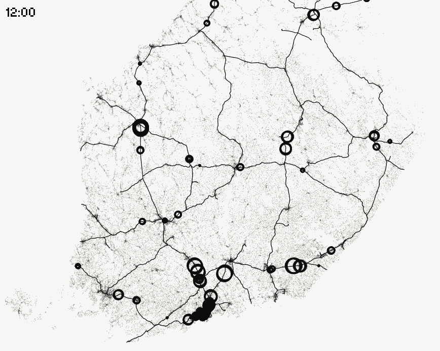
Looking at the final results, it is hard to believe that most of the visualisations have been created in a few hours. For example, the gif animation that utilises Helsiki’s building data provides an illustrative view of the growth explosion that took place in the capital city through the neighbourhood construction, which started in the 1960’s.At first, Tjukanov used cleaned up data in the QGIS programme to create 200 separate images of the building stock for each year. Then he combined those in an image editing programme into a gif animation. The style was true Tjukanov: a well prepared, media-friendly visualisation, which is easy to share on social media. How long does this take? “If I would make it again now, maybe half an hour.”
From Trump’s tweets to Finland’s most remote location
At the time of the interview in June 2018, Topi Tjukanov is using geographic information methods to find Finland’s most remote location. The idea came from a Belgian data visualisator, who asked Tjukanov for help with analysing building data of his home country. During July, Tjukanov’s more than 5,000 followers on Twitter got to know that Finland’s most remote location is in the Lemmenjoki National Park, 14.1 kilometres from the closest building. A corresponding analysis of Denmark and the UK will follow shortly.
President Trump’s tweets become increasingly mysterious when they are processed by the Trump Lost in Translation bot, coded by Tjukanov. Google Translate randomly translates Trump’s tweets into another language and finally back into English.
Daytimes Tjukanov furthers the conversion of Finnish detailed planning data to digital format at the Ministry of Environment. The visualisation hobby is a good counterbalance to the factual office work at the Ministry. “When you make visualisations for your own amusement, you can take them less seriously.”
Most visualisations are created with the QGIS programme. Tjukanov has studied Python programming for editing the data. Real life problems increased the motivation for browsing the Python guide.
See how #Helsinki has grown in the last 200 years. Created with #opendata from @kaupunkimittaus through @HRInfoshare pic.twitter.com/mC5M4BUSyt
— Topi Tjukanov (@tjukanov) March 27, 2017
Helsinki’s development over 200 years, animated into fifteen seconds.
Art made out of geographic information
Who?
Topi Tjukanov b. 1988
Education: Geographer, FM
Workplace: Ministry of the Environment
Favourite open data tools
1. QGIS “It’s nice that the programme can be used by anyone without licence fees. The development of the software has been very fast.
2. PostGIS
3. Python
What he has done with open data
Easy-to-share gif animations of geographic information, from real time movements of trains and boats to the development of cities through the centuries.
What data he would find interesting
“I would be interested in, for example, use data of Helsinki’s city bikes, but due to privacy protection, it will not be opened on a very detailed level. I do understand the concern, but in many cities the data has been opened. All movement data is of the type that would make very cool things.”
Mac, Windows or Linux
“Windows, sometimes I use Linux in a virtual environment.”
Greetings to the HRI service
“Keep up the good work.”
Visualisations of Topi Tjukanov in a blog and in Twitter.
In geographic information magazine Positio’s article Tjukanov is called a map artist. Tjukanov is flattered by the description and admits that the refinement of data may sometimes become art. “Everything is based on existing data, but sometimes I do something just because it looks good.”
Another thing pointing towards an artist soul is that the data processing is just a necessary evil. When the data is of good quality, you get straight to the funniest phase: thinking how it should be presented. “The best phase is when you have parsed the data and get to choose colours for the visualisation.”
The hobby has earned him some freelance gigs. For example, Helsingin Sanomat newspaper’s Airbnb article is based on data collected from the site by Topi Tjukanov about the 2,700 rented flats in Helsinki that are available in the Airbnb service. However, he is not going to quit his day job, even though it has crossed his mind at times. “Regular pay days and an eight to four job is pretty nice.”
HRI helped Tjukanov start off
Tjukanov browses the data in HRI from time to time. Tjukanov first got to know the service during his studies, when he and his mates started crafting an application that tells which terraces in Kallio are currently sunny. “The location data for the terraces was not available as open data at that time. We contacted the HRI people, the data was opened and we got the application done”, remembers Tjukanov.
The web service Porottaa.com from 2013 still works, but the restaurant data from five years ago has been become obsolete. Kallio’s restaurant base has seemingly undergone a rapid regeneration.
Overall, Tjukanov gives the grade “decent” for the openness of data in public administration. “Of course, you always wish that there could be this and that data. But when you share your stuff on Twitter, there are comments to the effect that if only we would have this kind of data at our disposal as well.”
Many of Tjukanov’s visualisations deal with movement. The sources have been open data reserves, but nowadays, every mobile phone in the pocket produces an incredible amount of personal data. Tjukanov, who has become a visualisation celebrity, has been able to get a sneak peek of an American company’s data, which includes spatial data of a thousand different mobile applications. “They gave me test material for viewing. The precision of the data was a bit scary. There you could see, for example, the location and speed of the phone, in which language it is being used, how much battery charge is left”, tells Tjukanov. “You can’t even imagine all the different kinds of data that there is about us.”
People’s privacy is much better protected in Europe than in the US, thanks to the EU’s new General Data Protection Regulation. The HRI service furthers the opening of public data reserves only. But even that is work aplenty for years to come in the capital region. So there will be more new raw material to the delight of Tjukanov and others who utilise it.
In May 2018, Topi Tjukanov spoke about his visualisations at the OPENVIS conference in Paris.
Translation: Henrik Andersson
Leave a Reply